marketgoo

Smarter onboarding

A rebuilt onboarding flow that reduces friction and helps users reach value faster.

Role
Senior Product Designer
Focus
Time to value
Team
2 product · 4 engineers
Stack
Figma · Posthog · Metabase
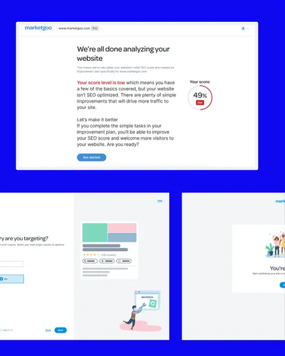
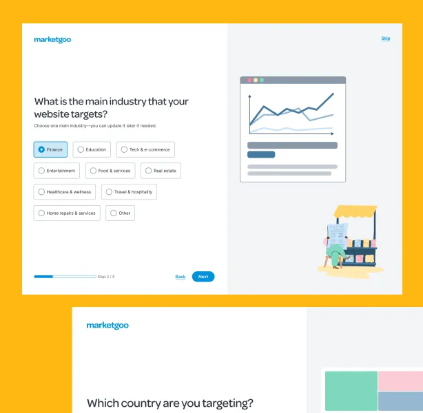
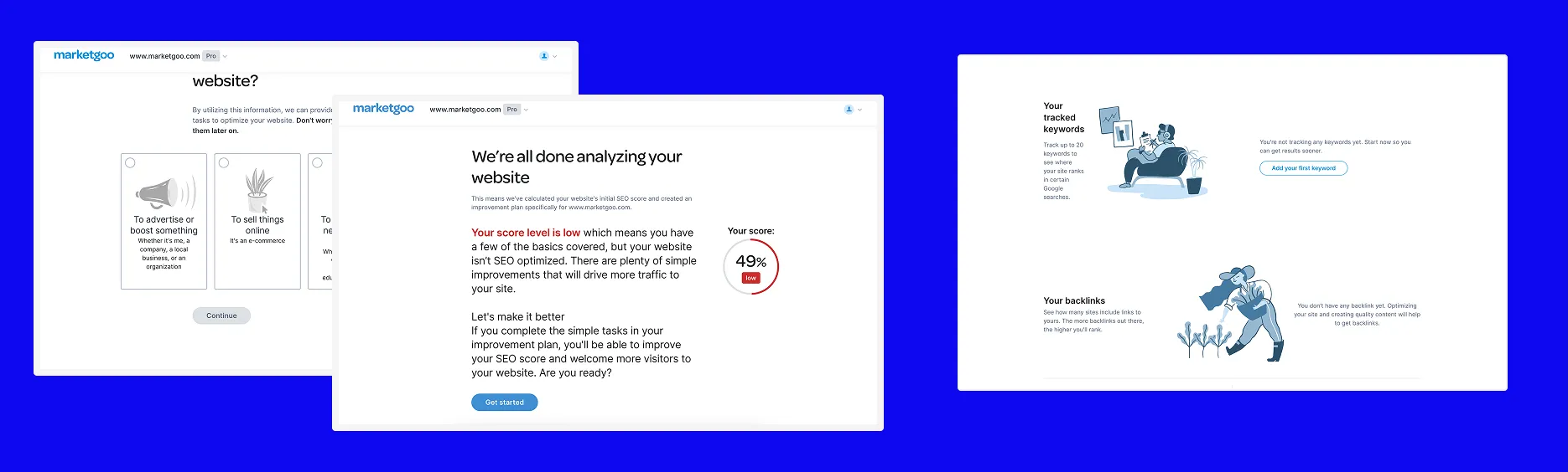
marketgoo onboarding wizard stepsmarketgoo onboarding results screen

Activation

~5% → ~15%


Wizard completion

~80%


Time to value

Value in the first session

Context

Business Context

marketgoo helps users improve their website SEO without needing technical knowledge. The product does the heavy lifting, but users need enough context to get started and see value quickly.

Recurrence was lower than expected. When product dug into why, the trail led somewhere earlier than expected, and that became the focus of this work.

Product

marketgoo Webapp + WordPress plugin

Business goal

Recurrence

Constraints

two platforms, mobile issues, AI-assisted steps
Problem Framing

The business raised a recurrence problem. Product traced it back to something earlier: activation was low, and the onboarding wizard was the reason.

We defined activation first and let it focus the work. A user is activated when they optimise their first page, the action our data ties to coming back. The wizard's job was to collect what the product needed to get there.

The old wizard asked for goal and country, then loaded a score. It was short, but it left the product with no context to work with. Empty states, a low score with no explanation, no next step. Users finished the wizard and left seconds later.

The problem wasn't the wizard itself, it was that it didn't set the product up to deliver value.

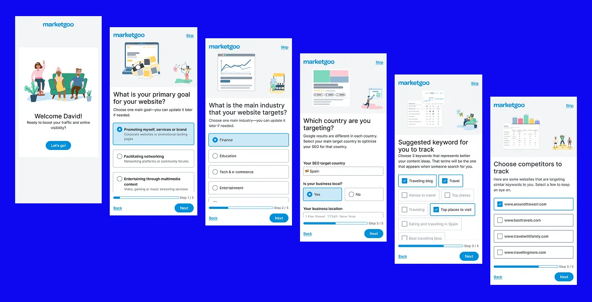
marketgoo onboarding wizard screens

Goal & Hypothesis

Goal

Get more users to their first optimised page, the point where the product actually works for them. That meant collecting the right context upfront, so the product opens with something real instead of blank.

Wizard completion
Activation
Time to value

Hypothesis

If we collect the right context upfront and remove blank states, more users will complete setup and reach a first optimised page. Activation rises, and the users who activate come back.

Strategy & Trade-offs

The strategy was to guide users through a structured setup that removed blank states and reduced decision fatigue. Instead of open inputs, curated options. Where we could pre-fill from public website data or AI, we did. Same logic across both platforms, adapted where execution required it.

Focus

Getting users to a first optimised page, fast. Remove blank states, cut decision fatigue, every step earning its place.

Left out

Google Analytics integration, a post-onboarding email sequence, and an activation checklist. All considered, all cut. The wizard was the drop-off point.

Trade-offs

  • Guidance vs. flexibility. More steps, more control, but more friction to manage.
  • Platform consistency vs. execution fit. Same logic, different implementation per platform.
  • Scope vs. time. Small team, real constraints. We cut what didn't move the needle.

Design process

Discovery

We reviewed drop-off and usage data in Posthog and Metabase, mapped where users were abandoning the old flow, and combined that with screen recordings.

The pattern was consistent across: users completed the wizard and left within seconds. Not because they didn't care, but because the product gave them nothing to stay for. No visible progress, so users had no sense of how far they were or what was coming. High cognitive load on the results screen, UI and UX issues, no feedback during loading, things that killed motivation at the exact moment the product was supposed to deliver its first value.

And empty states throughout, because the wizard hadn't collected enough to show anything useful.

Key Insight

Users weren't disengaged, they were disoriented. They'd done what the product asked and arrived at something that looked broken.

Define

Before designing anything, we aligned on what activation actually meant. The solution needed to do one thing clearly: collect the right inputs upfront so the product could show a real, meaningful first state, not a blank one. That definition drove every decision in the flow and kept the scope honest when other ideas came up.

Three principles guided the work:

  • Progressive disclosure, one decision at a time.
  • Pre-fill where possible, reduce the effort required from the user.
  • Never show a blank state, design the empty state out before it happens.

Key Product Decision

Expand the wizard to collect the right inputs upfront, using AI and public data to reduce the effort required from the user. The platform split also shaped planning here. WordPress and WebApp share the same logic, but keyword tracking differs between them, and the token requirement on some WordPress partner environments meant we had to design a clear entry path before the wizard itself began.

Design

We explored different possible solutions, starting from the existing flow and its pain points. The main challenge was giving users enough structure to complete setup without making the wizard feel longer or harder than the one it replaced.

We explored adding Google Analytics connection and a post-onboarding task checklist. Both were cut. The connection added too much friction at this stage. The checklist moved the problem downstream rather than solving it. The wizard was the drop-off point, so that's where we stayed.

Deliver

We worked closely with both devs throughout, especially on the AI-assisted suggestions and the pre-fill logic, which had real backend dependencies. The collaboration was tight from early design to release.

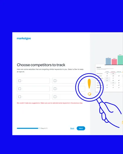
Testing surfaced edge cases we hadn't anticipated. The most important: What happens when the AI or 3rd party tools can't return suggestions? Or what happens if the user doesn't select any keywords?

We also used the redesign as an opportunity to fix existing mobile issues and deliver a fully responsive flow. The old wizard had never been properly adapted for smaller screens. With a rebuilt flow and new components, we made sure the experience worked across all devices from the start. After launch, we prepared a post-release survey to validate the experience with real users.

Solution

A guided setup that replaces open inputs with clear options and pre-filled suggestions, so choices are easy and the product opens with real data to work with.

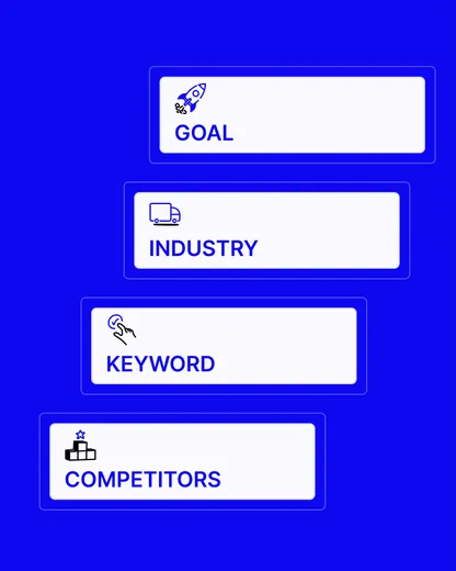
  1. Welcome

    Starting screen that presents the product

  2. Goal

    What the user wants from their site

  3. Industry

    The user's specific field

  4. Country

    Where the site operates

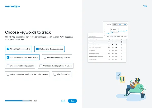
  5. Keywords

    AI-assisted

    AI suggests options, the user picks up to three. No blank field to fill.

    Choosing keywords to track in the marketgoo wizard
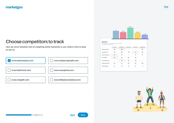
  6. Competitors

    AI-assisted

    AI proposes real competitors, the user picks up to three. Same as keywords, nothing typed from scratch.

    Choosing competitors to track in the marketgoo wizard
  7. Closing

    Hands off to a product that already has data to work with, first page ready to optimize.

RESULT: activation ~5% → ~15%

The product opens with real data, and the first optimized page is one step away.

Key design decisions

  • Pre-fill and guide

    Every decision that could be turned into a selection was. We used public website data and AI to pre-select or suggest keywords and competitors. Users still confirm or adjust, but they start from something rather than nothing.

  • Show progress, give control

    We made every step visible so users always knew where they were. The final handoff wasn't just the end of setup, it was the moment the product became theirs.

  • Design the empty state out

    If the wizard ended with gaps, the product would fail the user again on first load. Activation meant the product had everything it needed to show a real first experience. That definition shaped every step.

Reflection

What the project taught me

  • What worked

    Defining activation before designing anything. It kept the scope focused and made it easy to say no.

  • What didn't work

    Keyword and competitor suggestions struggle in low-data contexts. Users with niche businesses or very little public information still hit a near-empty list.

  • What I would improve

    A smarter fallback for low-context cases. And revisiting the Google Analytics connection as a next phase, now that the core wizard is stable.

  • Key learning

    Completion was never the problem, activation was. Get users to a real first action and they come back. Fix activation, recurrence follows.

Next project

Multibrand Design system

Multi-brand new design system adapted to the new branding.

If you're looking for a product designer — or just want tochat about ideas — feel free to drop me a message.

Always happy to connect.

Let's talk